|
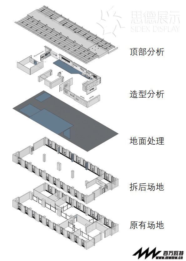
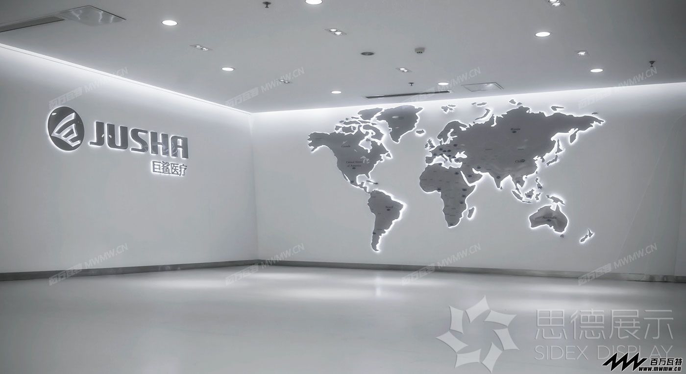
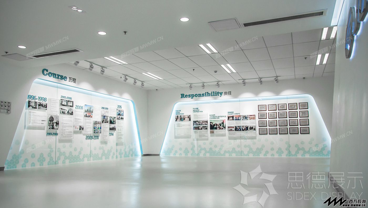
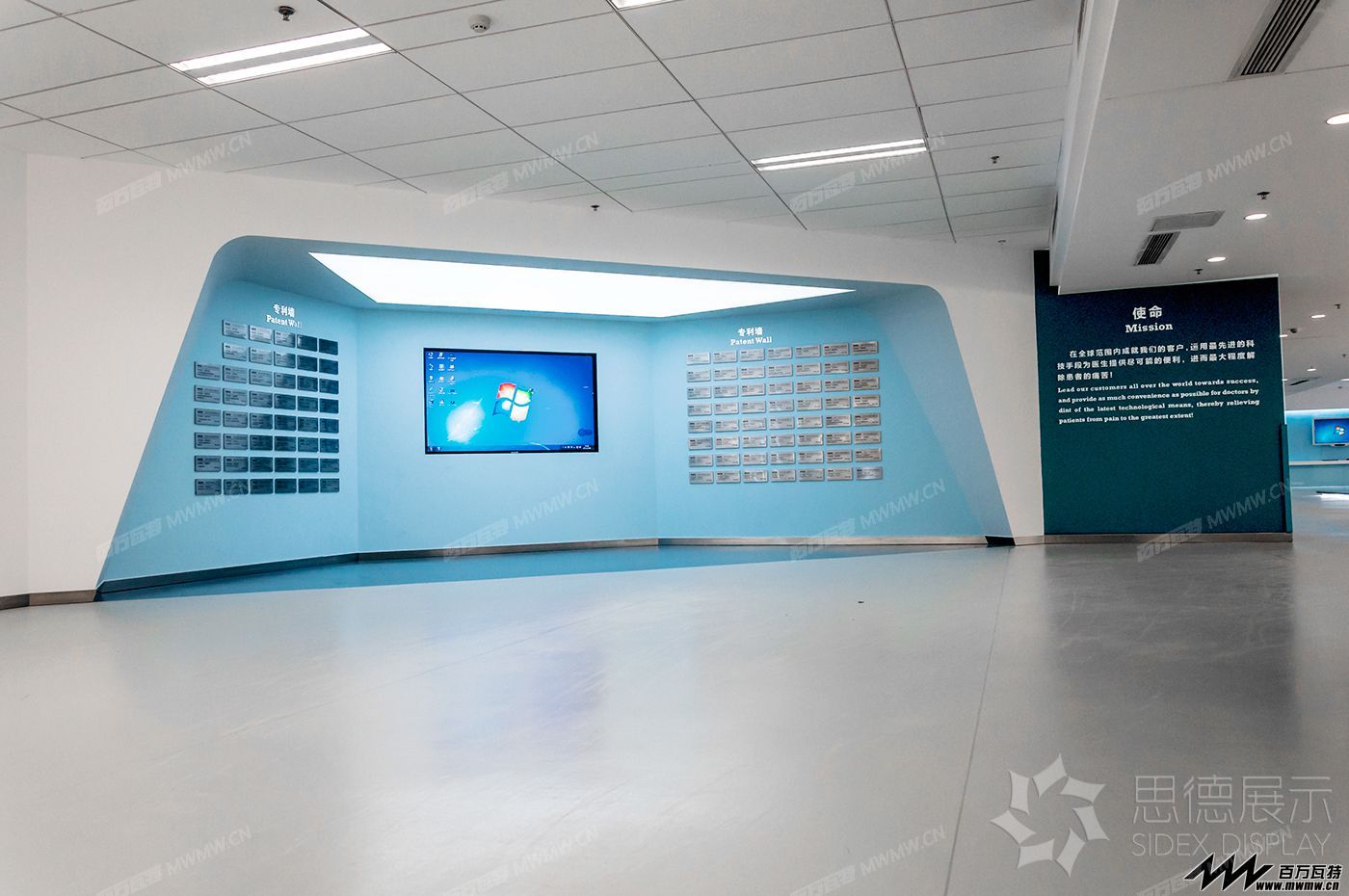
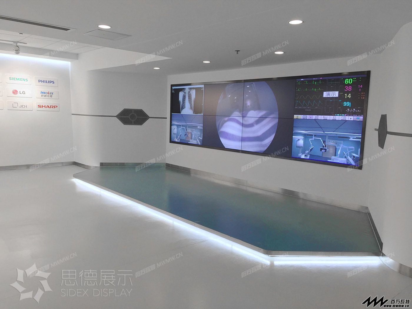
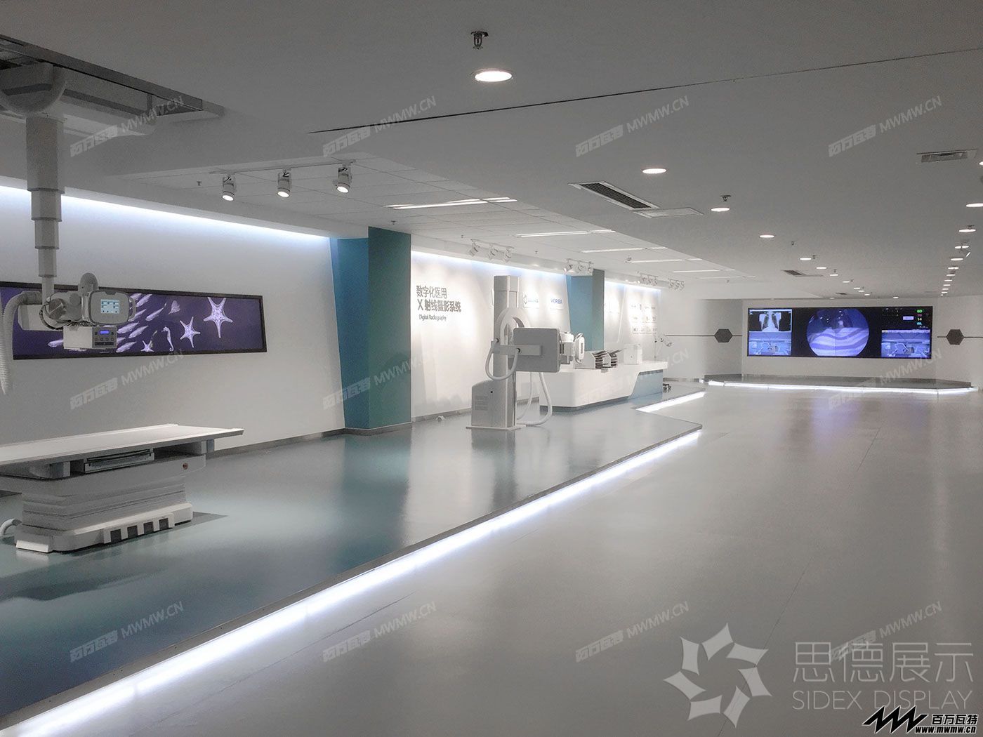
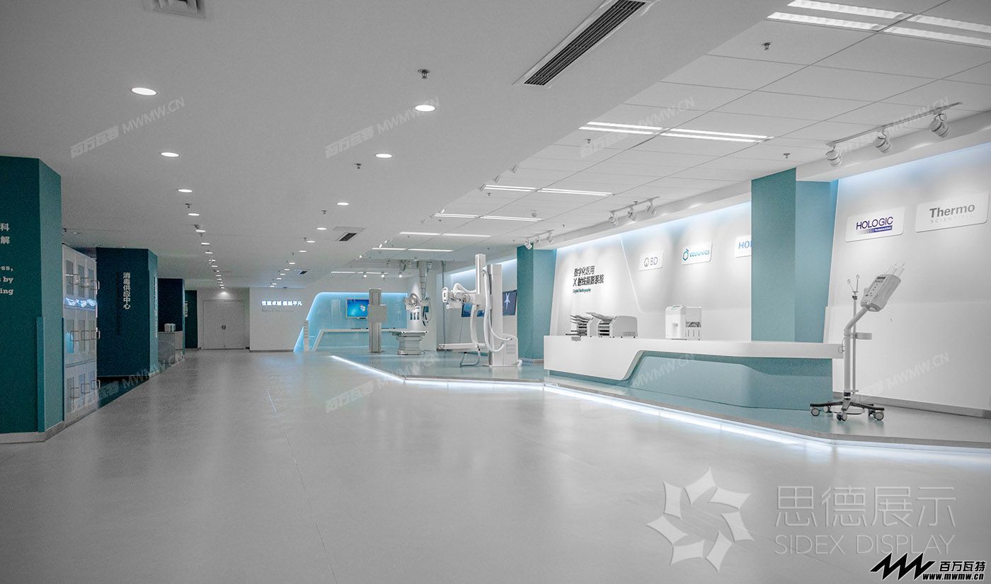
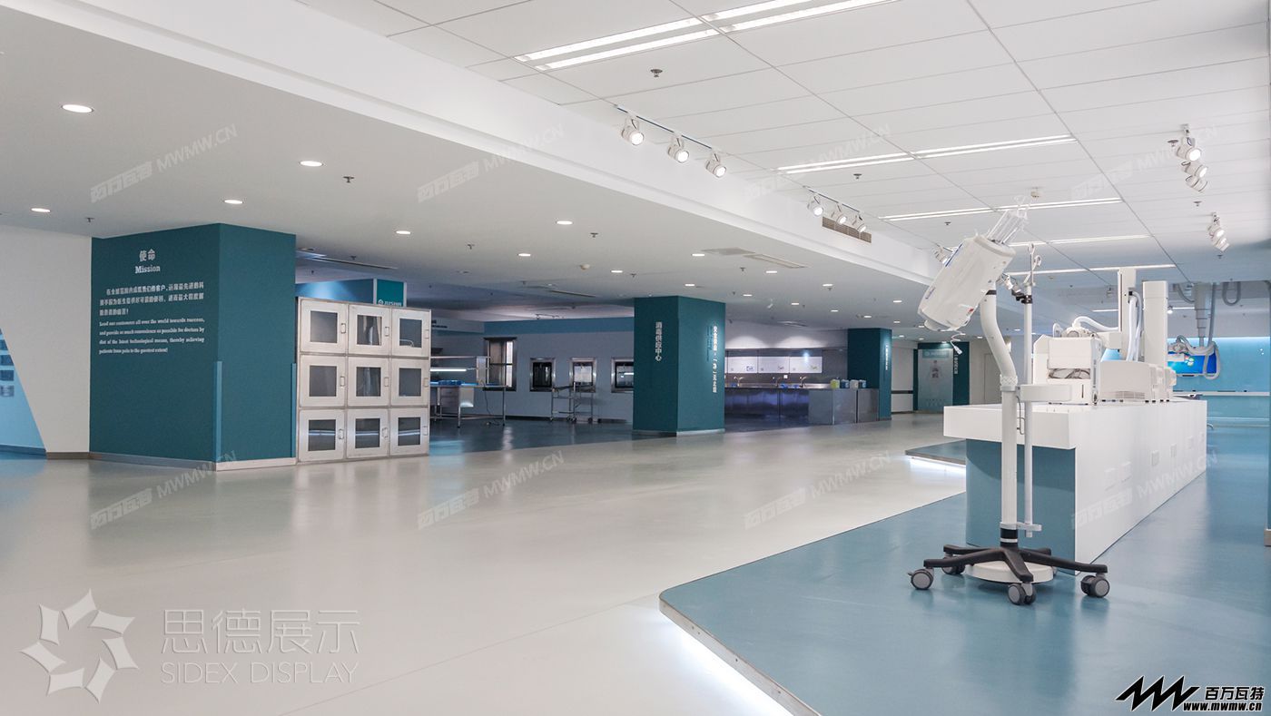
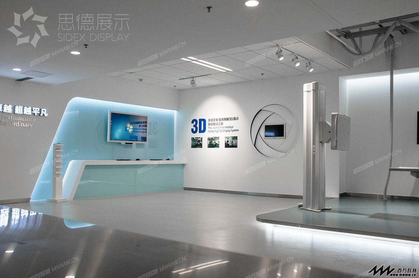
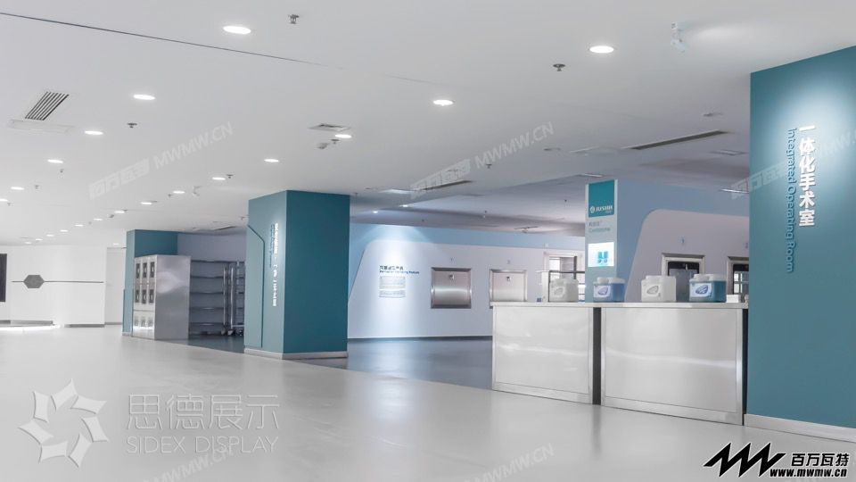
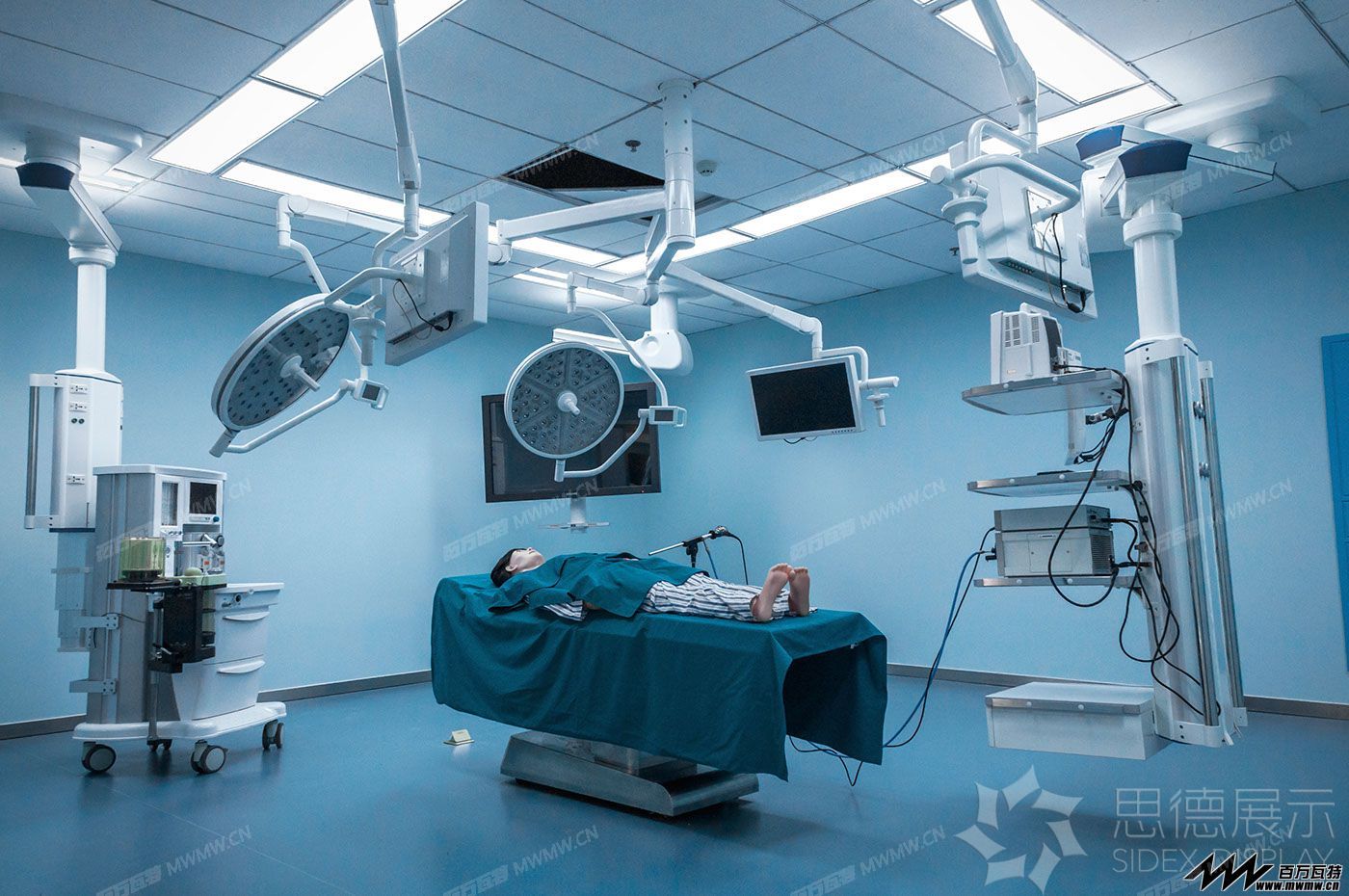
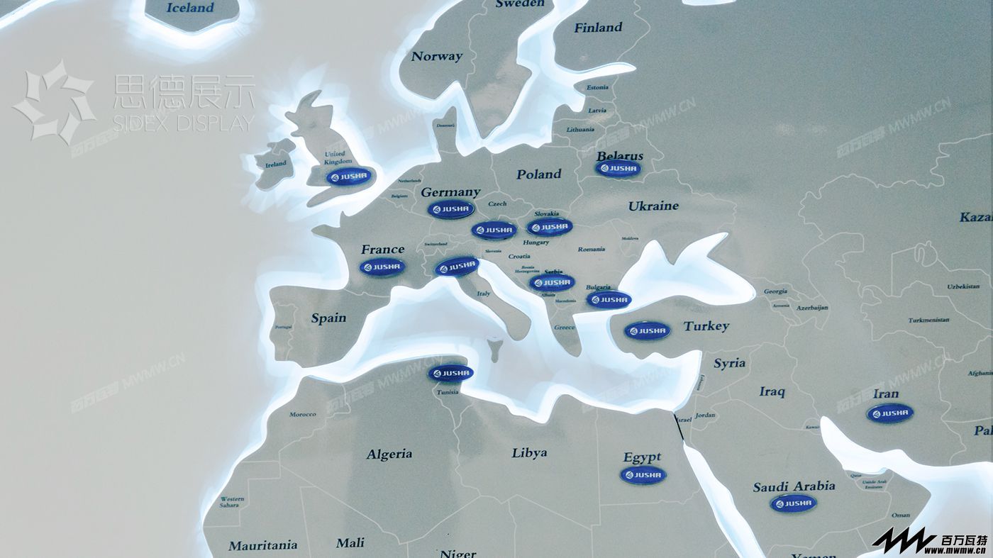
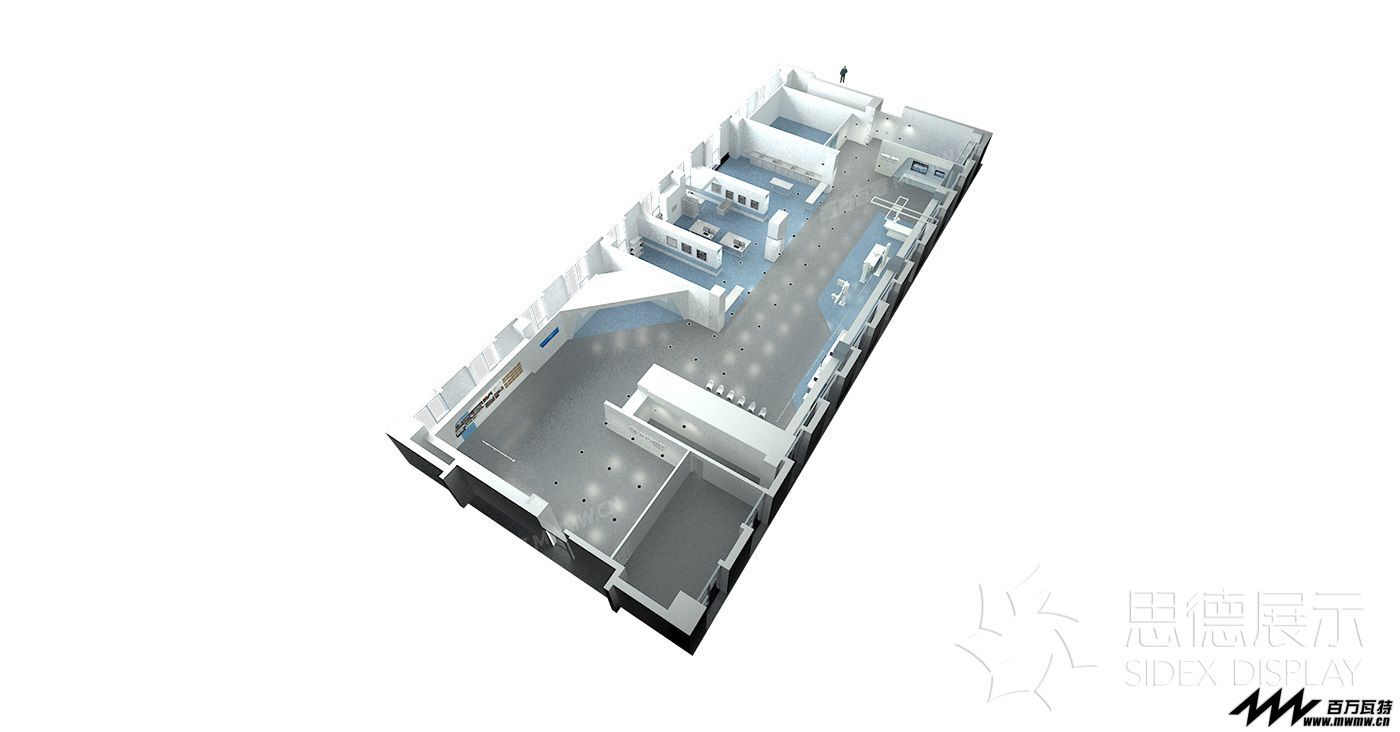
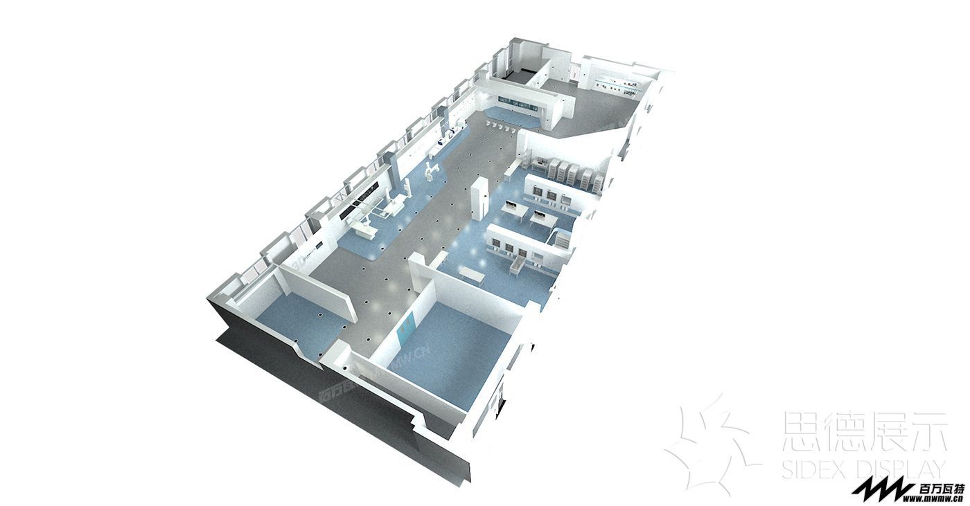
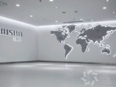
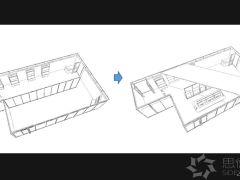
【思享品德】—巨鲨医疗企业展厅 【SIDEX】-Jusha medical Business Hall 项目背景: 设计时间:2015年6月 完成时间:2015年9月 项目性质:展示空间 主创设计:姜超 设计面积:800㎡ Start Time: June 2015 Completion Time: September 2015 Project Nature: Exhibition space Designer: JC Design Area: 800㎡ 主要材料: 有色烤漆板、钢化黑镜玻璃、高精度图文写真、立体雕刻字、不锈钢、乳胶漆 Main Materials: Colored paint, tempered black mirror glass, graphic photo, high precision, stainless steel, solid carved lettering paint 设计说明: 1.空间处理 本项目所在场地是办公大楼,办公场所改造为展示空间的空间处理过程中,本身就会面临诸多问题和限制,例如物业要求改造工程具备可恢复性。就空间本身,也面临了层高不同以及层高普遍较矮的问题,最低处2.9米为空调管道,贯穿整场且不在中轴线上。同时需要将企业文化区、专利展示区、远程会诊中心、商贸展示区、消毒供应中心、一体化手术室、阅片室七大展区合理的安排其中,并创造合理顺畅的参观动线。其中不乏需要按照医院的医院场景的模拟及还原。 2.展示理解 创造优秀的展示空间一定是基于对客户产品的充分理解,对于医疗行业的知识壁垒及巨鲨庞大的产品线的认知和理解,也是本项目的挑战之一。在有限的空间中,尽可能满足医院场景的标准要求。例如消毒供应中心产品线的展示,设计师需要去医院实地考察,并与相关负责人进行充分的交流共同,以便与客户创造一个更完美的展示解决方案。 3.视觉元素 在色彩选择方面,以医院场景、无菌无纺布、海洋作为提取元素。选取了素材的蓝灰色,降低蓝色的饱和度呈现出一种高级灰色调,突显巨鲨医疗的企业气质,同时不乏科技感和洁净感。 在立面造型方面,以鲨鱼的流线型和鱼鳍为设计原型,将立面造型多以斜面切面并加以倒圆角应用,从视觉上进一步加强巨鲨医疗的行业属性。部分立面通过倾斜处理, 配以间接照明,空间视觉在横纵两个方向进行延展。 NO.1 Space treatment This project site office building, Office space into a space of exhibition space in the process, itself faces a lot of problems and limitations, such as recoverability property requires renovation. Space itself, also faced a different storey and storey General short questions, minimum 2.9 meters for air conditioning ducts, throughout the whole game and not on the axis.As well as for corporate culture area, patent, exhibition area, tele-centers, trade show, sterilization and supply center, operating room, reading room seven exhibition reasonable arrangements which, dynamic lines and create a smooth visit. Simulation of hospital scenes which are needed by hospitals and restore. NO.2 Show understanding Create excellent exhibition space must be based on a full understanding of the customer, for healthcare industry knowledge barriers and giant sharks huge product line of knowledge and understanding, is one of the challenges of this project. In the limited space, as far as possible meet the standards of the hospital scenes. For example display of sterilization and supply Center product line, designers need to field trips to the hospital, and adequate communication with the officials to work with customers to create a more perfect solution. NO.3Visual elements In terms of color selection, hospital scenes, the sterile non-woven fabric, marine extracts elements. Blue-grey of the selected material, reducing the saturation of blue takes on a superior gray tones, highlighting the corporate temperament jusha medical, while there is no lack of sense of science and technology and clean feeling. |
-
2017-04-07
-
2017-03-22
-
2017-03-14
TA的作品
TA的主页

全部评论1